Wimpy
Timeline
6 weeks
Year
2021
Role
Designer
Disciplines
Brand Identity
Motion Graphics
Problem
Brief set by Turner Duckworth centred around Wimpy, who has lost its throne and relevancy with UK consumers to American fast-food brands such as McDonald’s and Burger King.
Insights
> From a survey done on UK customers, it was concluded that they prefer not to go to a fast-food restaurant than go to Wimpy.
>British Consumers love their Chips and will favourite brands based upon them.
>Wimpy’s customers love the Special Sauce, ranking and selling over 25,000 litres per year.
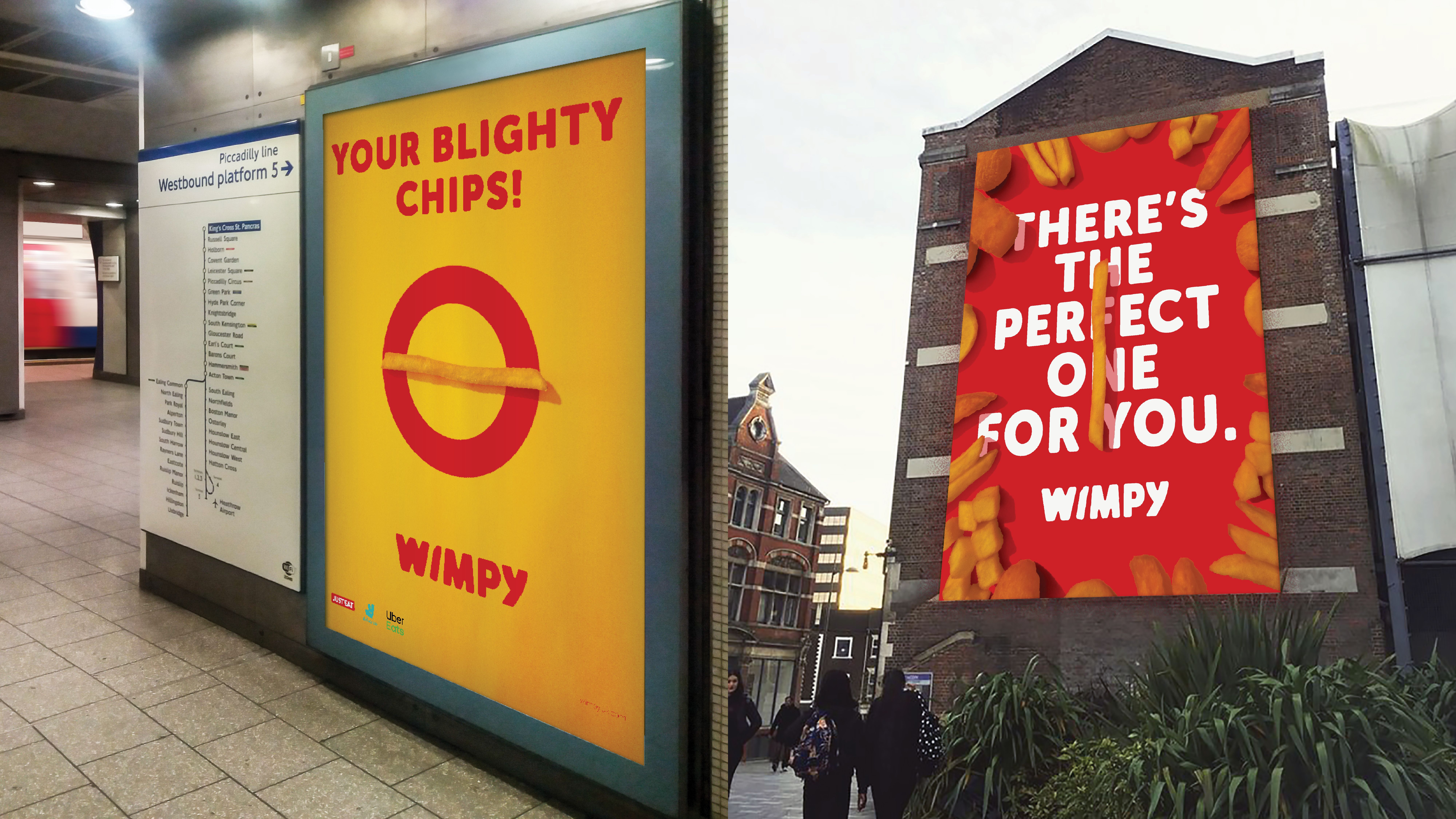
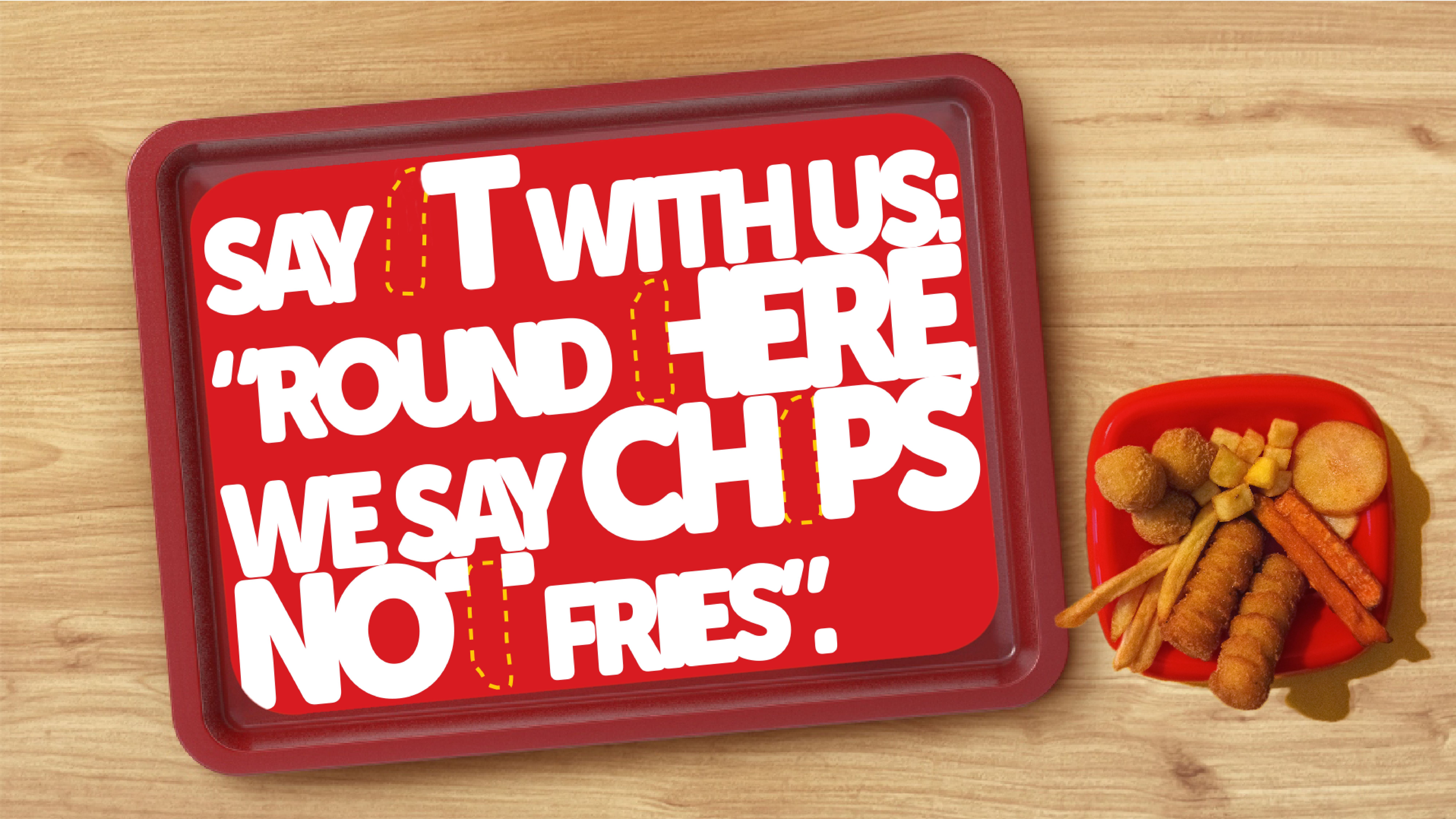
>Wimpy is widely known for its slogan “It’s Chips, not Fries” and known as the British fast-food brand.
>Wimpy has always been a pioneers, especially in socialfluidity, being the first ever restaurant to have Black and White table servers.
Source:
Statista (2016)
Wimpy (2021)
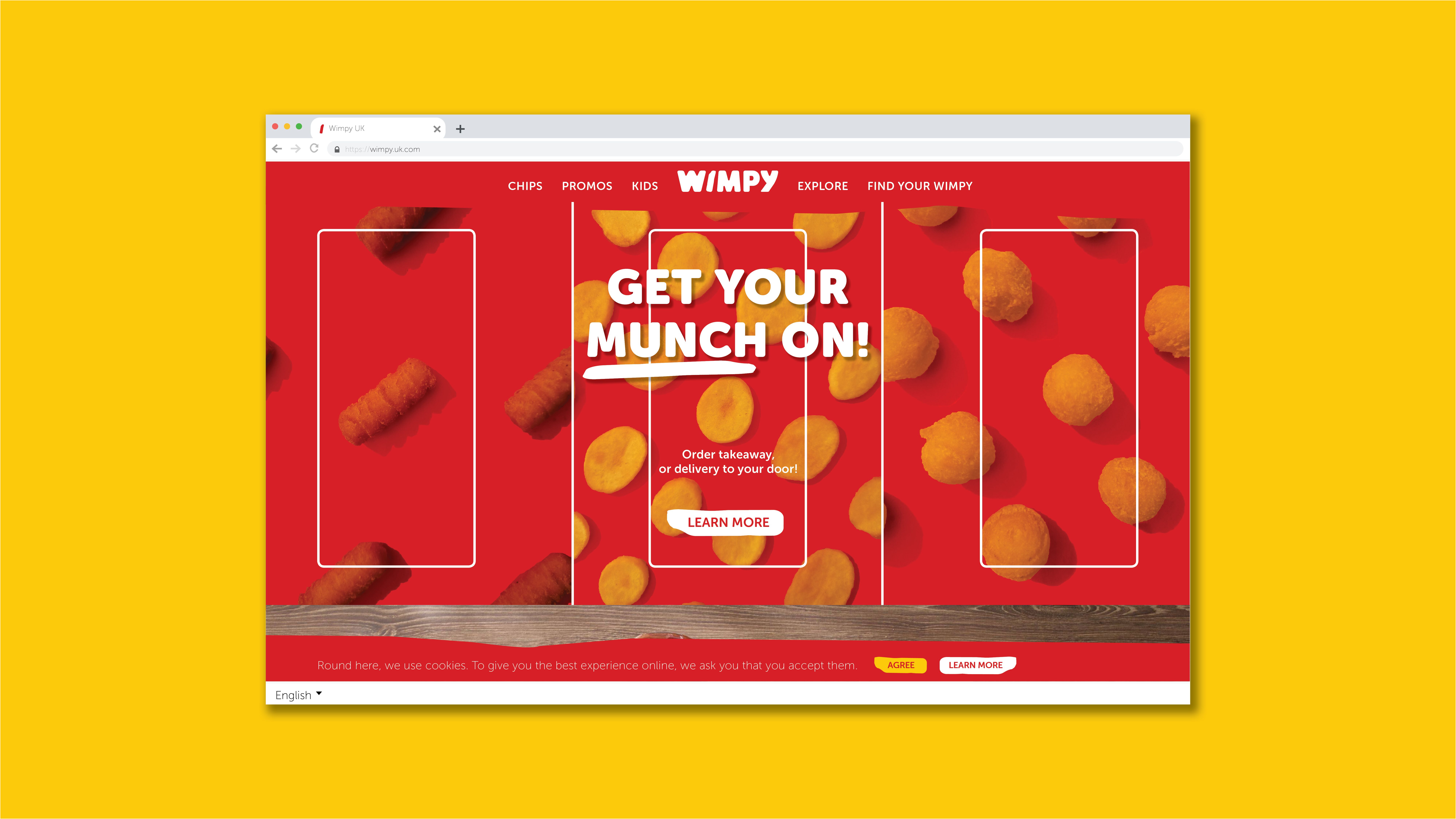
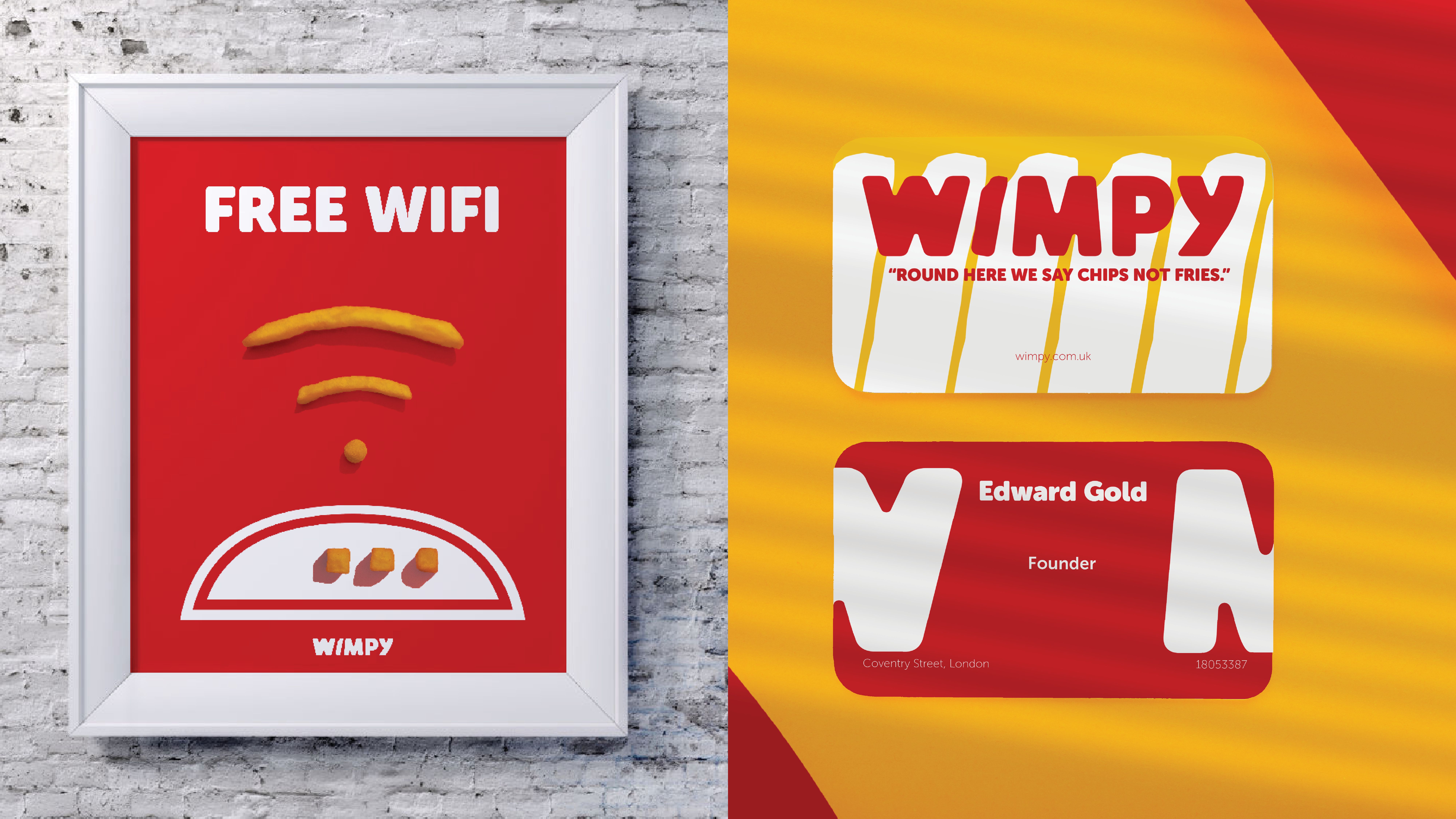
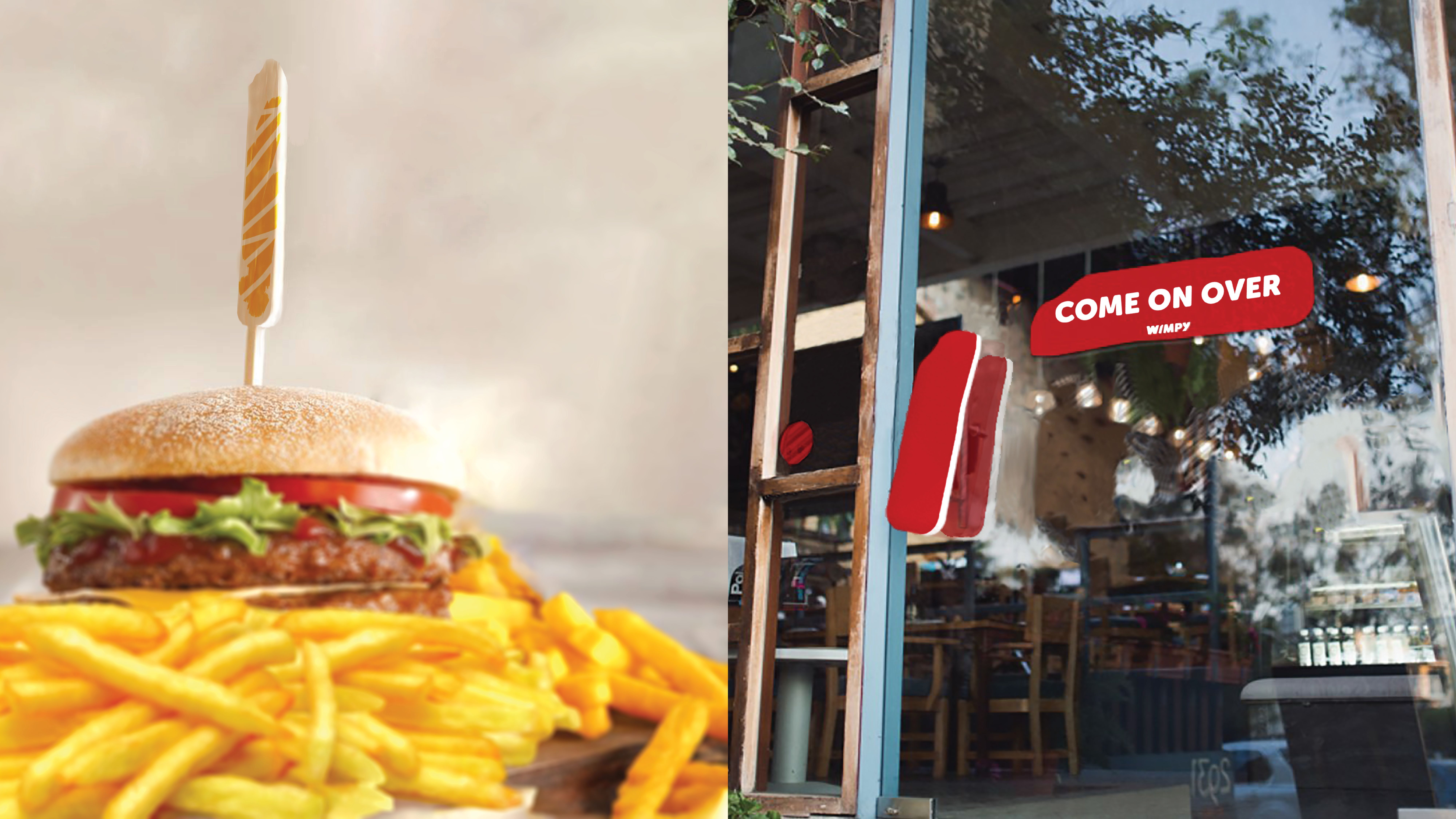
Solution
Leveraging its history, Inclusive and Playful Wimpy has returned to the High Street of London with a new love for Chips. While servicing the forefront of Chips, Wimpy thrives for convenience and remaining relevant to UK customers.
Design
Wimpy’s logo is a custom typeface inspired by previous Wimpy’s logos and the iconic usage of Museo. Inspired by past Wimpy logos, the new Wimpy logo collects and re-tells all the unique and artistic changes previously implemented while giving a more playful and bold look.
All photography was taken by me, specifically for this project, to get the food’s best representation possible.